library(readr)   # For reading and writing CSV data files

# Ensure you set your working directory to the
# source file location with `setwd()`

# Read a file located in the same directory as the script file
# Both a blank value and the value \N should be stored as NA
pit_stops <- read_csv("pit_stops.csv", na = c("", "\\N"))4 Data: First Steps
4.1 Read and Write Data Files
Resource: Wickham & Grolemund (2nd. ed.) chapter 8 and chapter 22
File Management Process (to save you a lot of heartache)
Create a source folder (e.g. My R Projects\first project)
Save the CSV file to your source folder
Save a blank R script file to your source folder
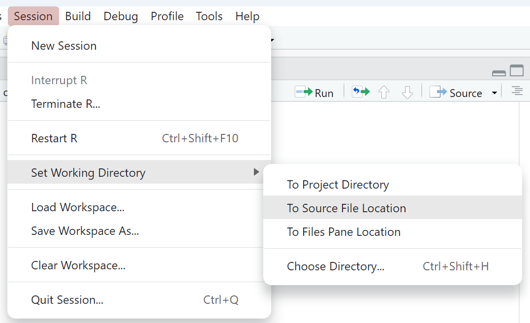
Use the RStudio GUI option for setting the working directory as shown in Figure 4.1: Session > Set working directory > To source file location
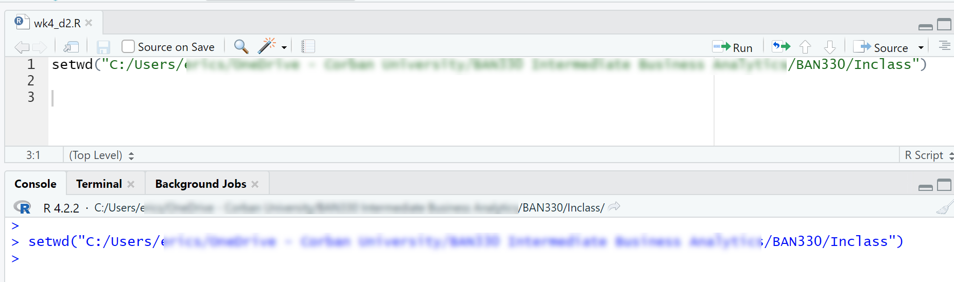
Copy the
setwd()command from the Console window into your R script file as shown in Figure 4.2
This file management process will simplify your coding life by ensuring your data file and R Script file are in the same folder as well as ensuring the working directory is always set to the correct path. These steps are not required, but they are very beneficial for beginning programmers. You will eventually use more complex folder structures as your coding skills develop and your projects become more complex.
4.1.1 Read CSV Files
Like many software tools, R has multiple ways of accomplishing tasks. Thus, R has multiple functions to read in files. Base R has the read.csv() function, which can be used to great effect. However, We will use the function read_csv() which is from the readr package in the tidyverse. The read_csv() function produces a tibble data frame, which has advantages over the base R data frame, and the read_csv() function is said to be faster than the base R read.csv() function.
The read_csv() function has many possible arguments. We will use the na argument to designate what values should be stored as “not available” (NA). Our data set uses the value “\N” to indicated an NA, so we need to ensure we include this in our list of values to store as NA. The \ is a special character and must be escaped, which means placing another \ in front of the character. Thus, we need \\N to mean \N.
The data used in weeks 4-6 is the 1950-2022 Formula 1 racing data hosted at Kaggle.
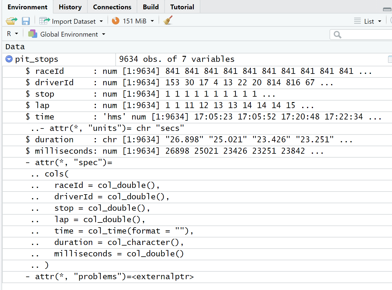
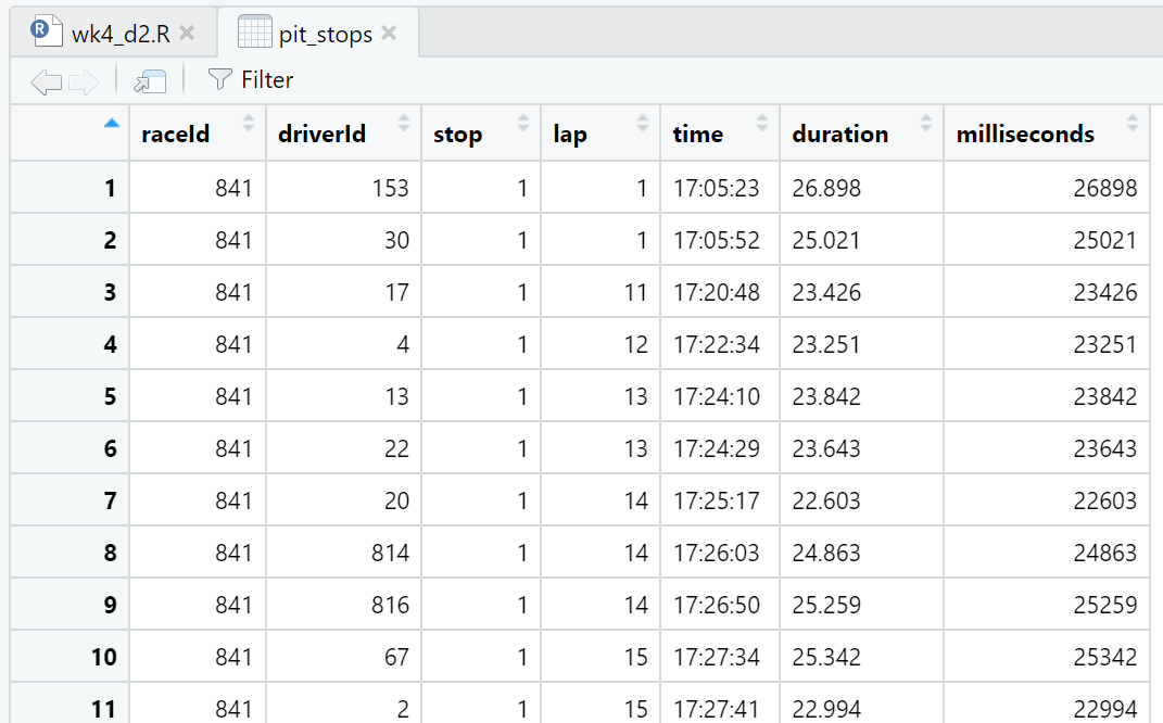
We can view details about the pit_stops data frame in both the Environment window (Figure 4.3) and the Script window (Figure 4.4). We can also view the first 10 observations (a.k.a. rows) of the data frame in the Console window by running just the name pit_stops in either the Script window or Console window (Listing 4.1). We use these different methods of viewing the data for different reasons. For example, both the Environment window and Console window output give us details about the data type of the variables (a.k.a. attributes) while the Script window view is like looking at a spreadsheet. We will explore more details in Section 4.2.
The duration of a pit stop in this data is a count of seconds starting when the car enters the pit lane and ending when the care leaves the pit lane. The actual work of a pit stop (e.g. tire changes, etc.) is much shorter than the time listed in this data. The fastest pit stop work on record is 1.88 seconds for Verstappen on lap 46 of the German Grand Prix in 2019. This data point shows up as 19.1 seconds in pit_stops.csv because of the driving time in the pit lane.
Listing 4.1: Console window output
pit_stops# A tibble: 9,634 × 7
raceId driverId stop lap time duration milliseconds
<dbl> <dbl> <dbl> <dbl> <time> <chr> <dbl>
1 841 153 1 1 17:05:23 26.898 26898
2 841 30 1 1 17:05:52 25.021 25021
3 841 17 1 11 17:20:48 23.426 23426
4 841 4 1 12 17:22:34 23.251 23251
5 841 13 1 13 17:24:10 23.842 23842
6 841 22 1 13 17:24:29 23.643 23643
7 841 20 1 14 17:25:17 22.603 22603
8 841 814 1 14 17:26:03 24.863 24863
9 841 816 1 14 17:26:50 25.259 25259
10 841 67 1 15 17:27:34 25.342 25342
# … with 9,624 more rowsIt is best to follow the File Management Process (Section 4.1) when first learning R. And, it is also good to see how to load data files that are not in the same directory as the script file.
Listing 4.2: Read a CSV file in a different directory
library(readr)   # For reading and writing CSV data files

# Ensure you set your working directory to the
# source file location with `setwd()`

# When the data file is located in a subdirectory called `data`
pit_stops <- read_csv("data/pit_stops.csv", na = c("", "\\N"))

# When the data file is in the parent directory
pit_stops <- read_csv("../pit_stops.csv", na = c("", "\\N"))

# When the data file is located in a subdirectory called
# `data` that is located in the parent directory
pit_stops <- read_csv("../data/pit_stops.csv", na = c("", "\\N"))
4.1.2 Write CSV Files
Use the tidyverse function write_csv() to save a CSV file. Much like read_csv(), the write_csv() function has several advantages over the base R function write.csv(). The directory syntax used with read_csv() (Listing 4.2) can also be used to write files to directories other than the directory with the script file.
library(readr)   # For reading and writing CSV data files

# Ensure you set your working directory to the
# source file location with `setwd()`

# Save a file in the same directory as the script file
write_csv(pit_stops,"new_pit_stops.csv")

# Save a file to a subdirectory called `data`
write_csv(pit_stops,"data/new_pit_stops.csv")
4.1.3 Reading Excel files
You can read Excel files using the read_excel() function in the readxl package. Note that you must include the extension, either .xls or .xlsx, in the file name.
library(readxl) # For reading and writing CSV data files
# Ensure you set your working directory to the
# source file location with `setwd()`
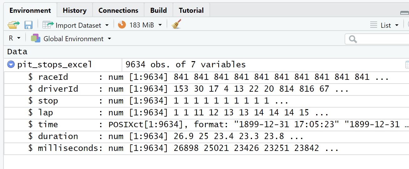
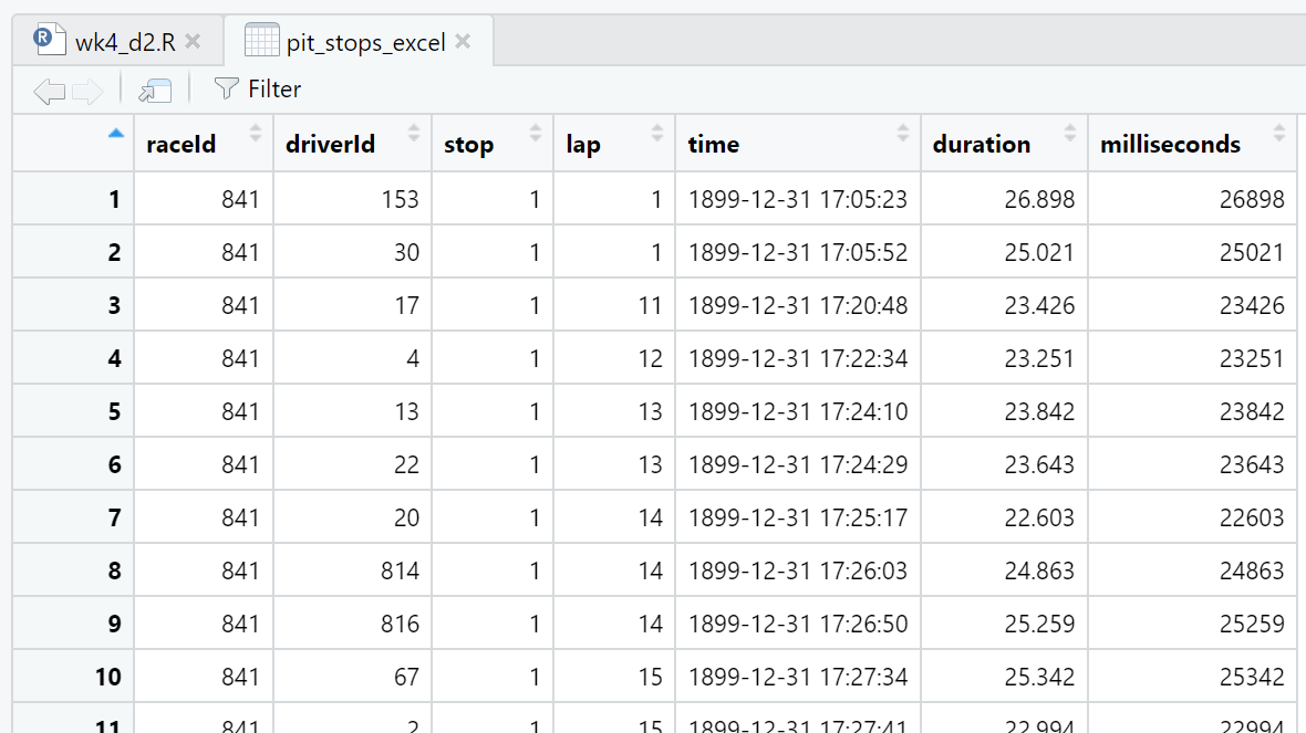
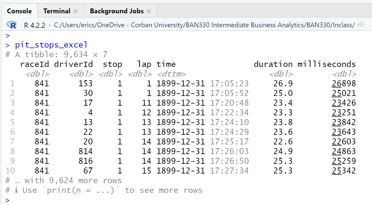
pit_stops_excel <- read_excel("pit_stops_excel.xlsx")The pit_stops_excel.xlsx file was made by opening the pit_stops.csv file in Excel and then saving the file as a .xlsx. No changes were manually made to the data in Excel. However, Excel evaluates and interprets data types when converting .csv to .xlsx. This process resulted in significant changes to the data in the time attribute and a change of type for the duration attribute.
First, the read_excel() function call generated warnings for every observation of the time attribute.
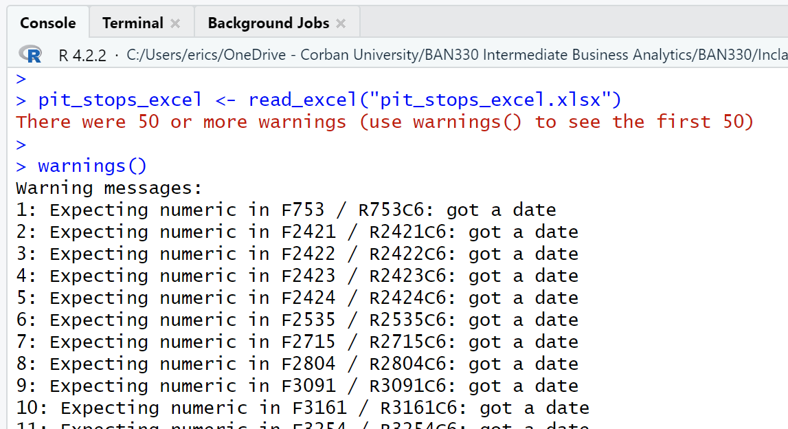
Second, as can be seen in the three views of the data frame (Figure 4.6, Figure 4.7, Figure 4.8), Excel has modified every observation of the time attribute by adding a date with year, month, and day. Excel also converted duration from character type to double. Interestingly, using Excel to save the pit_stops_excel.xlsx file as a .csv file and then importing that new .csv file with read_csv() eliminates both the time and duration attribute changes.
4.2 Manipulate Data
Resource: Wickham & Grolemund (2nd. ed.) chapter 4, sections 4.1 through 4.4
Resource: dplyr documentation
Viewing a data frame in the Environment window, Script window, and Console window (Section 4.1.1) are just the beginning of the ways we can explore data.
The $ allows us to select a single attribute from a data frame. Thus, pit_stops will print the first 10 observations of all attributes of the data frame, while pit_stops$duration will print the first 1,000 observations of only the duration attribute (Figure 4.9).
library(readr)   # For reading and writing CSV data files

# Ensure you set your working directory to the
# source file location with `setwd()`

# Read a file located in the same directory as the script file
pit_stops <- read_csv("pit_stops.csv", na = c("", "\\N"))

# Print the first 10 observations to the Console window
pit_stops

# Print the first 1,000 observations of `duration` to the Console window
pit_stops$duration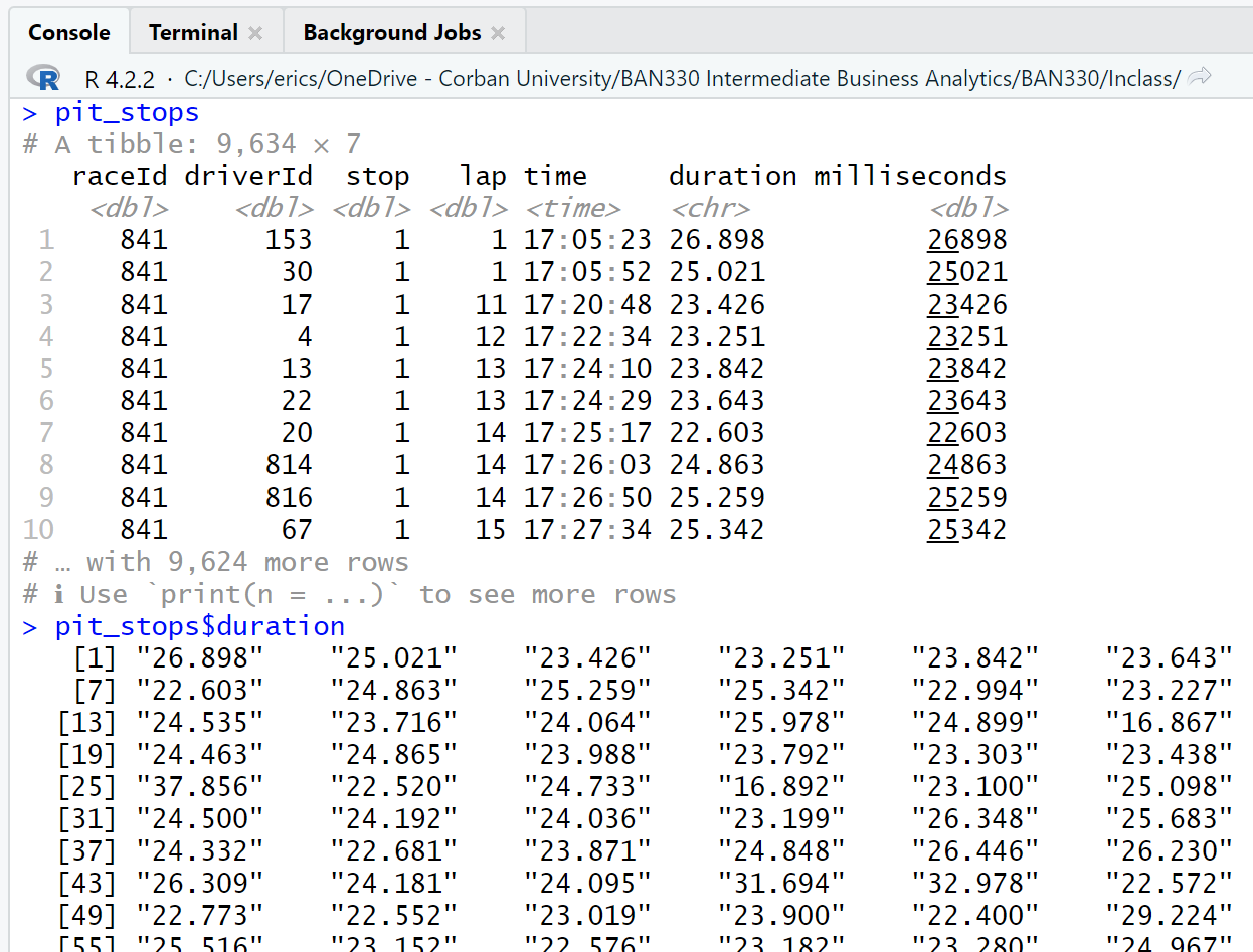
The Console window output of the observations of the duration attribute are sequenced left-to-right and then down to the next row. Thus, row one of the output contains observations 1 - 6. Row two of the output contains observations 7-12. Notice that each row of the output is labeled with the observation number that begins that row.
A quick scan of the pit_stops$duration output reveals an anomaly in observation 752. The data for that observation is not like the data for the other observations that we can see. We can view all the attributes for the 752nd observation with pit_stops[752,].
pit_stops[752,]# A tibble: 1 × 7
raceId driverId stop lap time duration milliseconds
<dbl> <dbl> <dbl> <dbl> <time> <chr> <dbl>
1 853 817 1 1 14:08:50 16:44.718 1004718The row and column reference inside [] after the data frame name indicate the desired rows and/or columns. The format is: data_frame[row_numbers, column_numbers]. Quoted column names inside the combine function, c(), can be used as substitutes for the column numbers.
A little math explains why the duration attribute of the 752nd observation looks odd. The milliseconds of this observation equal 1,004,718. There are 1,000 milliseconds in a second. Sixty seconds in a minute. Thus, there are 60,000 milliseconds in a minute.
\[ 1,004,718\ /\ 60,000 = 16.745\ minutes\]
Thus, observation 752 was a pit stop that lasted 16 minutes 44.718 seconds.
What is the length of a normal pit stop?
Questions drive data analysis. Without questions, or more precisely, without the need to find answers to questions, there is no need for data analysis.
We will pursue an answer to our question by exploring a 10-year window of pit stops from 2013 to 2022. The first raceId in 2013 is 880, and the raceId counts up from there. Thus, we can subset 10 years of pit stops (2013 - 2022) by selecting raceId equal to or greater than 880.
The full data set contains over a dozen CSV files with data spanning 1950 through 2022. However, the pit_stops.csv file only contains data spanning 2011 through 2022. This information is not obvious in the pit_stops data frame. We need to look at the races.csv fiile to match the raceId with the year to learn what years the pit_stops data frame covers. We will use the races.csv in Section 4.2.0.1.
library(dplyr)    # Manipulating data

# Filter observations with `raceId` greater than or equal to 880
pit_stops |>
  filter(raceId >= 880)

# Create a new data frame with the filter
ps_13_22 <- pit_stops |>
  filter(raceId >= 880)
The summary function can be used to generate a wide range of summary statistics.
summary(ps_13_22$milliseconds) Min. 1st Qu. Median Mean 3rd Qu. Max.
13266 22246 23883 85590 27025 3069017 This output is useful, but could be more useful if we create an attribute that displays seconds rather than milliseconds. We can do this with the mutate() function, which adds a new attribute based on calculations from an existing attribute. The mutate() function will perform the calculation on all 7,574 rows of our data frame.
# Create a new attribute named `seconds` based on dividing
# the attribute `milliseconds` by 1000
# This code will only display the results
ps_13_22 |>
  mutate(seconds = milliseconds / 1000)

# This code will add the new attribute to our existing data frame
ps_13_22 <- ps_13_22 |>
mutate(seconds = milliseconds / 1000)summary(ps_13_22$seconds) Min. 1st Qu. Median Mean 3rd Qu. Max.
13.27 22.25 23.88 85.59 27.02 3069.02 The 3rd quartile is 27.02 seconds. Thus, 75% of the pit stops from 2013 - 2022 were below 27.02 seconds.
The median is 23.88 seconds and the mean is 85.59 seconds, which indicates significant positive skewness (i.e. there is a long tail on the right-hand side of the distribution.) We can view the 100 observations with the longest pit stops to learn a bit more.
ps_13_22 |>
  filter(seconds > 27.02) |>     # filter criteria
  arrange(desc(seconds)) |>      # sort criteria;`desc` is descending
  print (n = 100)                # number to print criteria
Sorting in ascending order is the default of the arrange() function. Thus, if we used arrange(seconds) in this code block the output would provide the 100 shortest pit stops.
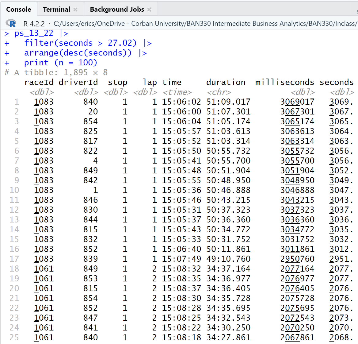
A scan of the output reveals that there are multiple observations for a given race (raceId) that occur on the same lap (lap) and have nearly the same duration of pit stop (duration). This indicates that at least some of the positive skew is caused by race conditions that force all drivers into the pit lane at the same time (e.g. a red flag). Thus, these are not normal pit stops.
We can group the observations by race and then calculate the median and mean for each race. We use the summarise() function from the dplyr package rather than the summary() function used above because the summary() function does not work well with group_by().
ps_13_22 |>
  group_by(raceId) |>
  summarise (median = median(seconds), mean = mean(seconds))
# A tibble: 200 × 3
raceId median mean
<dbl> <dbl> <dbl>
1 880 22.7 23.1
2 881 22.4 27.3
3 882 20.7 21.1
4 883 22.2 23.0
5 884 19.9 21.2
6 885 25.2 26.4
7 886 21.3 21.5
8 887 25.2 26.3
9 888 20.3 23.9
10 890 22.3 22.2
# … with 190 more rowsThere were 200 races during the 10 year period of 2013-2022. The medians and means for the first 10 races are all quite close, indicating that these races did not have race conditions that forced all drivers into the pit lane. We can learn more by reproducing all of the statistics from the summary() function.
ps_13_22 |>
  group_by(raceId) |>
  summarise (
    min = min(seconds),
    quant_1 = quantile(seconds, 0.25),      # 0.25 indicates the first quantile
    median = median(seconds),
    mean = mean(seconds),
    quant_2 = quantile(seconds, 0.75),      # 0.75 indicates the third quantile
    max = max(seconds)
  )
# A tibble: 200 × 7
raceId min quant_1 median mean quant_2 max
<dbl> <dbl> <dbl> <dbl> <dbl> <dbl> <dbl>
1 880 21.5 22.0 22.7 23.1 23.4 36.6
2 881 20.7 21.6 22.4 27.3 23.8 123.
3 882 19.3 20.2 20.7 21.1 21.3 27.0
4 883 21.0 21.6 22.2 23.0 23.0 41.5
5 884 13.3 19.4 19.9 21.2 20.8 74.0
6 885 19.6 24.7 25.2 26.4 25.8 40.5
7 886 14.4 20.8 21.3 21.5 22.0 29.1
8 887 24.1 24.8 25.2 26.3 26.3 35.2
9 888 19.0 19.8 20.3 23.9 21.2 162.
10 890 16.5 21.9 22.3 22.2 22.6 24.8
# … with 190 more rowsThe max statistics reveals that several of the first 10 races had at least one very long pit stop.
4.2.0.1 Joining Data Frames
Viewing the pit stop data with a raceId and no year is inadequate. We can do better. We can do better by merging multiple CSV files that contain the data we want to use. We will use the races.csv to get the year and the drivers.csv to get the driver’s name. We will perform the following steps to accomplish our goal.
Load the needed librarires and read in the CSV files.
Prepare the
pit_stopsdata frame by adding aps.secondscalculation as we previously did with the 2013 to 2022 data frame, retaining only certain attributes, and renaming several attributes.Prepare the
racesdata frame by retaining only certain attributes and renaming several attributes.Prepare the
driversdata from by retaining only certain attributes and renaming several attributes.Join the three prepared data frames by matching
raceIdanddriverId
We have four options for how to join our data frames in step 5. The four options are explained on the mutating joins page of the dplyr package. We will use the inner_join() function, An inner join keeps all observations that are in both data frames and merges the observations based on the attribute we specify.
Steps 2 - 5 could be done in one giant piped statement. However, the write code for people ethos encourages us to write multiple shorter piped statements.
# Step 1
# Load the needed libraries
# then read in the data files

library(readr)   # Reading and writing CSV data files
library(dplyr)   # Manipulating data

# Ensure you set your working directory to the
# source file location with `setwd()`
pit_stops <- read_csv("pit_stops.csv", na = c("", "\\N"))
races <- read_csv("races.csv", na = c("", "\\N"))
drivers <- read_csv("drivers.csv", na = c("", "\\N"))
# Step 2
# Create a prepared pit_stops data frame with `ps.seconds` attribute
pit_stops_prep <- pit_stops |>
mutate(ps.seconds = milliseconds / 1000) |> # New calculated attribute
select( # Retain these attributes
raceId,
driverId,
stop,
lap,
time,
ps.seconds
) |>
rename( # Rename these attributes
ps.number = stop,
ps.lap = lap,
ps.time = time
)# Step 3
# Create a prepared races data frame by keeping only certain attributes
# and rename several attribute
races_prep <- races |>
select( # Retain these attributes
raceId,
year,
round,
circuitId,
name,
date
) |>
rename( # Rename these attributes
race.name = name,
race.number = round,
race.date = date)# Step 4
# Create a prepared drivers data frame by keeping only certain attributes
# then rename several attributes
drivers_prep <- drivers |>
select( # Retain these attributes
driverId,
number,
code,
forename,
surname,
dob,
nationality
) |>
rename( # Rename these attributes
driver.number = number,
driver.code = code,
driver.nationality = nationality
)# Step 5
# Create the full pit stops data frame using the prepared data frames
# Join `pit_stops_prep` with `races_prep` based on `raceId`
# then join the data frame just created with `drivers_prep` based on `driverId`
ps_full <- pit_stops_prep |>
inner_join(races_prep, by = "raceId") |>
inner_join(drivers_prep, by = "driverId")The ps_full data frame has 19 attributes and 9,634 observations, which is the same number of observations in the pit_stops data frame.
ps_full# A tibble: 9,634 × 17
raceId driverId ps.nu…¹ ps.lap ps.time ps.se…² year race.…³ circu…⁴ race.…⁵
<dbl> <dbl> <dbl> <dbl> <time> <dbl> <dbl> <dbl> <dbl> <chr>
1 841 153 1 1 17:05:23 26.9 2011 1 1 Austra…
2 841 30 1 1 17:05:52 25.0 2011 1 1 Austra…
3 841 17 1 11 17:20:48 23.4 2011 1 1 Austra…
4 841 4 1 12 17:22:34 23.3 2011 1 1 Austra…
5 841 13 1 13 17:24:10 23.8 2011 1 1 Austra…
6 841 22 1 13 17:24:29 23.6 2011 1 1 Austra…
7 841 20 1 14 17:25:17 22.6 2011 1 1 Austra…
8 841 814 1 14 17:26:03 24.9 2011 1 1 Austra…
9 841 816 1 14 17:26:50 25.3 2011 1 1 Austra…
10 841 67 1 15 17:27:34 25.3 2011 1 1 Austra…
# … with 9,624 more rows, 7 more variables: race.date <date>,
# driver.number <dbl>, driver.code <chr>, forename <chr>, surname <chr>,
# dob <date>, driver.nationality <chr>, and abbreviated variable names
# ¹ps.number, ²ps.seconds, ³race.number, ⁴circuitId, ⁵race.nameThe structure function, str(), gives the full list of attributes with their types and a few examples of each attribute.
str(ps_full)tibble [9,634 × 17] (S3: tbl_df/tbl/data.frame)
$ raceId : num [1:9634] 841 841 841 841 841 841 841 841 841 841 ...
$ driverId : num [1:9634] 153 30 17 4 13 22 20 814 816 67 ...
$ ps.number : num [1:9634] 1 1 1 1 1 1 1 1 1 1 ...
$ ps.lap : num [1:9634] 1 1 11 12 13 13 14 14 14 15 ...
$ ps.time : 'hms' num [1:9634] 17:05:23 17:05:52 17:20:48 17:22:34 ...
..- attr(*, "units")= chr "secs"
$ ps.seconds : num [1:9634] 26.9 25 23.4 23.3 23.8 ...
$ year : num [1:9634] 2011 2011 2011 2011 2011 ...
$ race.number : num [1:9634] 1 1 1 1 1 1 1 1 1 1 ...
$ circuitId : num [1:9634] 1 1 1 1 1 1 1 1 1 1 ...
$ race.name : chr [1:9634] "Australian Grand Prix" "Australian Grand Prix" "Australian Grand Prix" "Australian Grand Prix" ...
$ race.date : Date[1:9634], format: "2011-03-27" "2011-03-27" ...
$ driver.number : num [1:9634] NA NA NA 14 19 NA 5 NA NA NA ...
$ driver.code : chr [1:9634] "ALG" "MSC" "WEB" "ALO" ...
$ forename : chr [1:9634] "Jaime" "Michael" "Mark" "Fernando" ...
$ surname : chr [1:9634] "Alguersuari" "Schumacher" "Webber" "Alonso" ...
$ dob : Date[1:9634], format: "1990-03-23" "1969-01-03" ...
$ driver.nationality: chr [1:9634] "Spanish" "German" "Australian" "Spanish" ...We can now manipulate the ps_full data frame in much more descriptive ways.
# Summary statistics for each year
# Remember, the original data file, `pit_stops.csv` contained data
# on only pit stops from 2011 - 2022.
ps_full |>
  group_by(year) |>
  summarise (
    min = min(ps.seconds),
    quant_1 = quantile(ps.seconds, 0.25),      # 0.25 indicates the first quantile
    median = median(ps.seconds),
    mean = mean(ps.seconds),
    quant_2 = quantile(ps.seconds, 0.75),      # 0.75 indicates the third quantile
    max = max(ps.seconds)
  )
# A tibble: 12 × 7
year min quant_1 median mean quant_2 max
<dbl> <dbl> <dbl> <dbl> <dbl> <dbl> <dbl>
1 2011 12.9 21.2 22.4 24.4 24.5 1005.
2 2012 13.2 20.8 22.3 23.3 24.9 52.2
3 2013 13.3 21.5 22.9 24.1 24.6 162.
4 2014 16.1 22.9 24.3 55.1 26.4 1137.
5 2015 16.1 22.8 24.3 25.5 26.5 107.
6 2016 16.2 22.4 24.1 124. 28.3 2011.
7 2017 14.9 22.0 23.7 56.8 26.5 1595.
8 2018 15.0 22.1 23.7 24.7 25.7 56.7
9 2019 15.1 22.2 23.5 24.9 26.1 69.0
10 2020 16.4 22.6 24.6 161. 29.6 1530.
11 2021 14.9 21.9 24.3 220. 30.7 2077.
12 2022 14.0 22.0 23.9 123. 27.9 3069. # Summary statistics for each race in 2022
ps_full |>
group_by(race.number) |>
filter (year == 2022) |>
summarise (
min = min(ps.seconds),
quant_1 = quantile(ps.seconds, 0.25), # 0.25 indicates the first quantile
median = median(ps.seconds),
mean = mean(ps.seconds),
quant_2 = quantile(ps.seconds, 0.75), # 0.75 indicates the third quantile
max = max(ps.seconds)
)# A tibble: 22 × 7
race.number min quant_1 median mean quant_2 max
<dbl> <dbl> <dbl> <dbl> <dbl> <dbl> <dbl>
1 1 24.2 24.7 25.1 25.4 25.7 30.5
2 2 15.1 20.7 21.4 21.8 22.4 33.7
3 3 17.4 18.2 18.4 18.5 18.9 20.4
4 4 29.6 30.4 31.0 31.7 32.2 41.0
5 5 18.4 19.0 19.5 20.1 20.0 32.4
6 6 21.6 22.1 22.4 23.0 23.1 31.1
7 7 24.4 25.3 27.6 418. 1174. 1187.
8 8 20.2 21.2 22.1 23.1 23.0 41.5
9 9 23.2 23.8 24.0 25.6 25.2 43.0
10 10 28.2 28.9 29.8 1120. 3037. 3069.
# … with 12 more rows# Summary statistics for each driver in 2022
ps_full |>
group_by(surname) |>
filter (year == 2022) |>
summarise (
min = min(ps.seconds),
quant_1 = quantile(ps.seconds, 0.25), # 0.25 indicates the first quantile
median = median(ps.seconds),
mean = mean(ps.seconds),
quant_2 = quantile(ps.seconds, 0.75), # 0.75 indicates the third quantile
max = max(ps.seconds)
)# A tibble: 22 × 7
surname min quant_1 median mean quant_2 max
<chr> <dbl> <dbl> <dbl> <dbl> <dbl> <dbl>
1 Albon 14.1 21.8 23.4 54.4 24.8 1186.
2 Alonso 15.8 21.8 23.8 144. 25.3 3056.
3 Bottas 18.4 22.6 24.7 173. 26.0 3056.
4 Gasly 14.0 21.9 23.6 133. 28.9 3049.
5 Hamilton 14.2 21.9 24.0 144. 25.7 3047.
6 Hülkenberg 21.4 24.7 26.2 25.3 26.9 27.4
7 Latifi 14.5 22.4 24.3 120. 28.8 3052.
8 Leclerc 14.0 21.7 23.5 129. 26.0 3036.
9 Magnussen 14.2 22.4 25.2 121. 29.8 3064.
10 Norris 17.6 22.2 24.4 133. 27.4 3043.
# … with 12 more rowsWe should save this data set as we will be using it in future class sessions.
write_csv(ps_full, "ps_full.csv")4.3 Visualize Data I
Resource: Wickham & Grolemund (2nd. ed.) chapter 2, sections 2.1 through 2.3
Data set: ps_full from Section 4.2.0.1.
Base R has many visualization functions, and there are many, many packages that provide advanced or specialized visualization functons. We will use the tidyverse package ggplot2 (documentation) for visualizations.
The “gg” stands for Grammar of Graphics, and is based on Wickham (2010), which is available in a pre-print version. ggplot2 provides a layered approach to building visualizations. Each ggplot2 function call requires one or more layers. Each layer includes the following:
Data source
Aesthetic mapping that defines the x-axis and y-axis
One geometric object that defines the shape placed on the visualization
One statistical transformation, which defaults to none if no transformation is provided
One position adjustment, which defaults to none if no adjustment is provided
Because #4 and #5 default to none (technically, identity), we can build a ggplot2 visualization by providing #1, #2, and #3.
library(readr)   # For reading and writing CSV data files
library(dplyr)   # Filtering data
library(ggplot2) # Visualizing data

# setwd()

ps_full <- read_csv("ps_full.csv")

ggplot(data = ps_full,                              # 1-Data
       mapping = aes(x = year, y = ps.seconds)) +   # 2-Aesthetic
  geom_point()                                      # 3-Geometric
Visualizations will appear in the Plots window of RStudio. 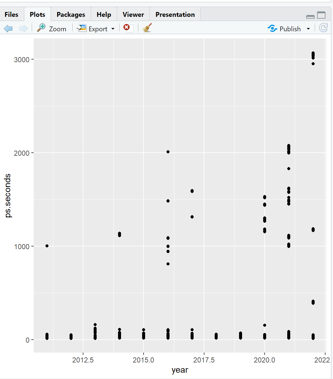
Note the use of the + operator at the end of the second line of ggplot() in the code above. The + operator allows us to stack functions together to build a complete visualization.
The call to ggplot() can be simplified by dropping the data = and mapping =. The first argument is always the data source. The second argument is always the aesthetics with x-axis and y-axis mapping. The following code produces the same plot as the code above (Figure 4.10).
ggplot(ps_full, aes(x = year, y = ps.seconds)) +  # 1&2-Data & Aesthetic
  geom_point()                                    # 3-Geometric
The call to ggplot() can be further improved with the use of pipes. Again, this produces the same plot as the two calls to ggplot() above (Figure 4.10).
ps_full |>                                   # 1-Data
  ggplot(aes(x = year, y = ps.seconds)) +    # 2-Aesthetic
  geom_point()                               # 3-Geometric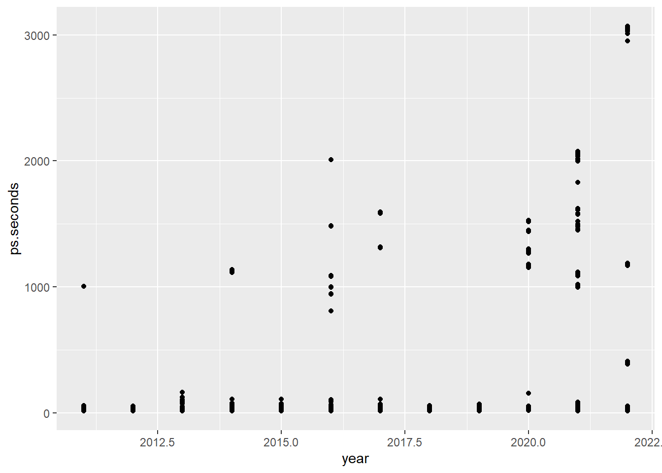
Using pipes allows us to easily manipulate our data for the visualization.
ps_full |>
  filter(ps.seconds < 130) |>     # Limit the plot to pit stops less than 130 seconds
  ggplot(aes(x = year, y = ps.seconds)) +
  geom_point()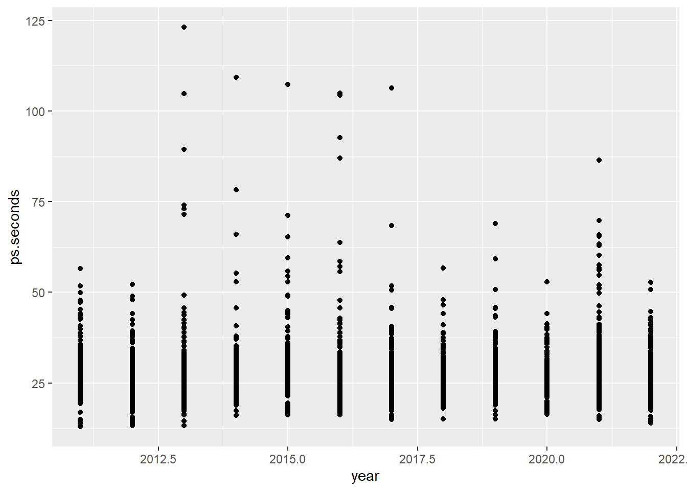
Visualizing 2022 by driver last name results in unreadable x-axis labels.
ps_full |>
  filter(ps.seconds < 130 & year == 2022) |>
  ggplot(aes(x = surname, y = ps.seconds)) +
  geom_point()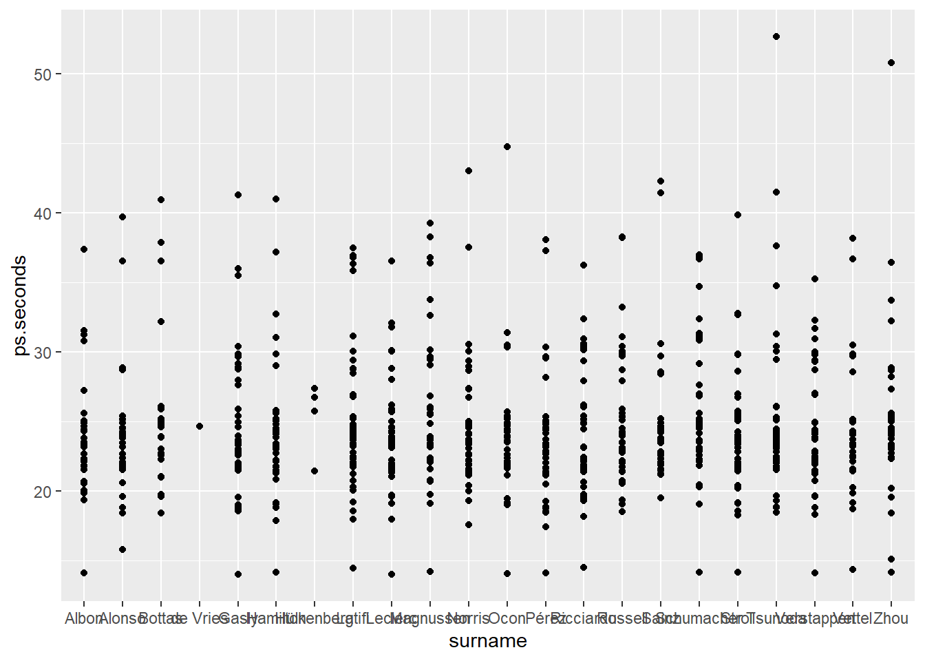
We can adjust the axis labels with the theme() function. theme() controls many non-data elements on the ggplot() visualization. In the code below we set the x-axis to an angle of 45-degrees (angle) and adjust the vertical (vjust) and horizontal (hjust) positions. You should play with these values to learn how each works.
ps_full |>
  filter(ps.seconds < 130 & year == 2022) |>
  ggplot(aes(x = surname, y = ps.seconds)) +
  geom_point() +
  theme(axis.text.x = element_text(angle = 45, vjust = 1, hjust = 1))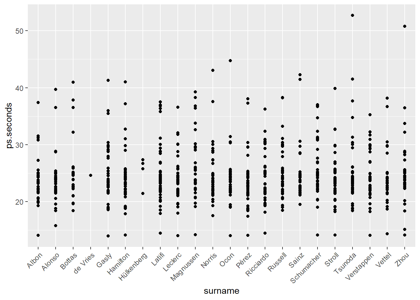
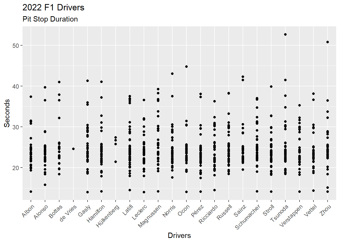
There are other non-data items we can add to a visualization. For example, labels via the labs() function.
ps_full |>
  filter(ps.seconds < 130 & year == 2022) |>
  ggplot(aes(x = surname, y = ps.seconds)) +
  geom_point() +
  theme(axis.text.x = element_text(angle = 45, vjust = 1, hjust = 1)) +
  labs(
    title = "2022 F1 Drivers",
    subtitle = "Pit Stop Duration",
    x = "Drivers",
    y = "Seconds"
  )
4.4 Visualize Data II
Resource: Wickham & Grolemund (2nd. ed.) chapter 2, sections 2.3 through 2.7
Data set: ps_full from Section 4.2.0.1.
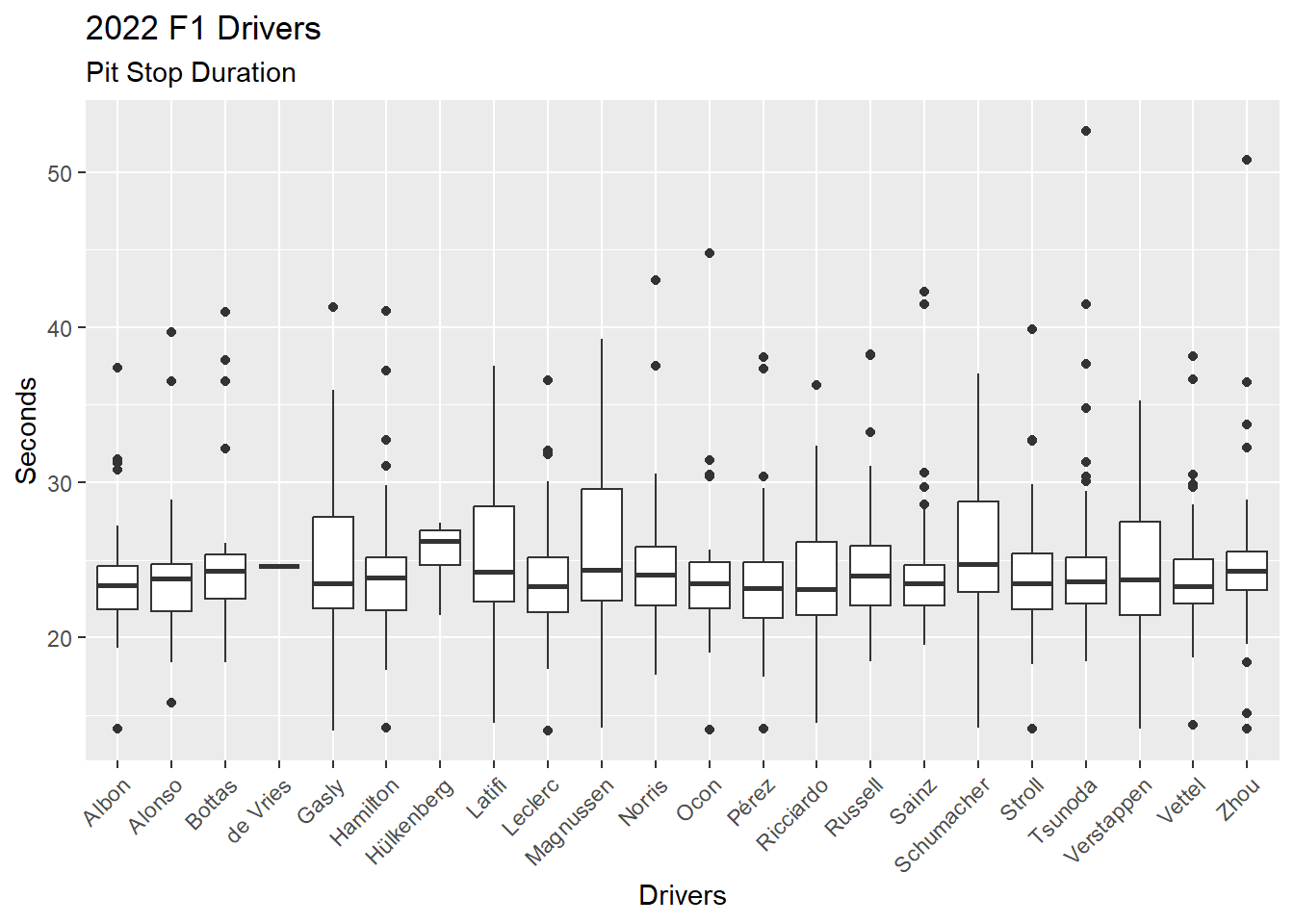
We can change the scatter plot (Figure 4.14) into a boxplot for each driver by changing the geometric from geom_point() to geom_boxplot(). Figure 4.15 provides a boxplot for each driver, showing the median, 1st and 3rd quartiles, and outliers (dots).
ps_full |>
  filter(ps.seconds < 130 & year == 2022) |>
  ggplot(aes(x = surname, y = ps.seconds)) +
  geom_boxplot() +
  theme(axis.text.x = element_text(angle = 45, vjust = 1, hjust = 1)) +
  labs(
    title = "2022 F1 Drivers",
    subtitle = "Pit Stop Duration",
    x = "Drivers",
    y = "Seconds"
  )
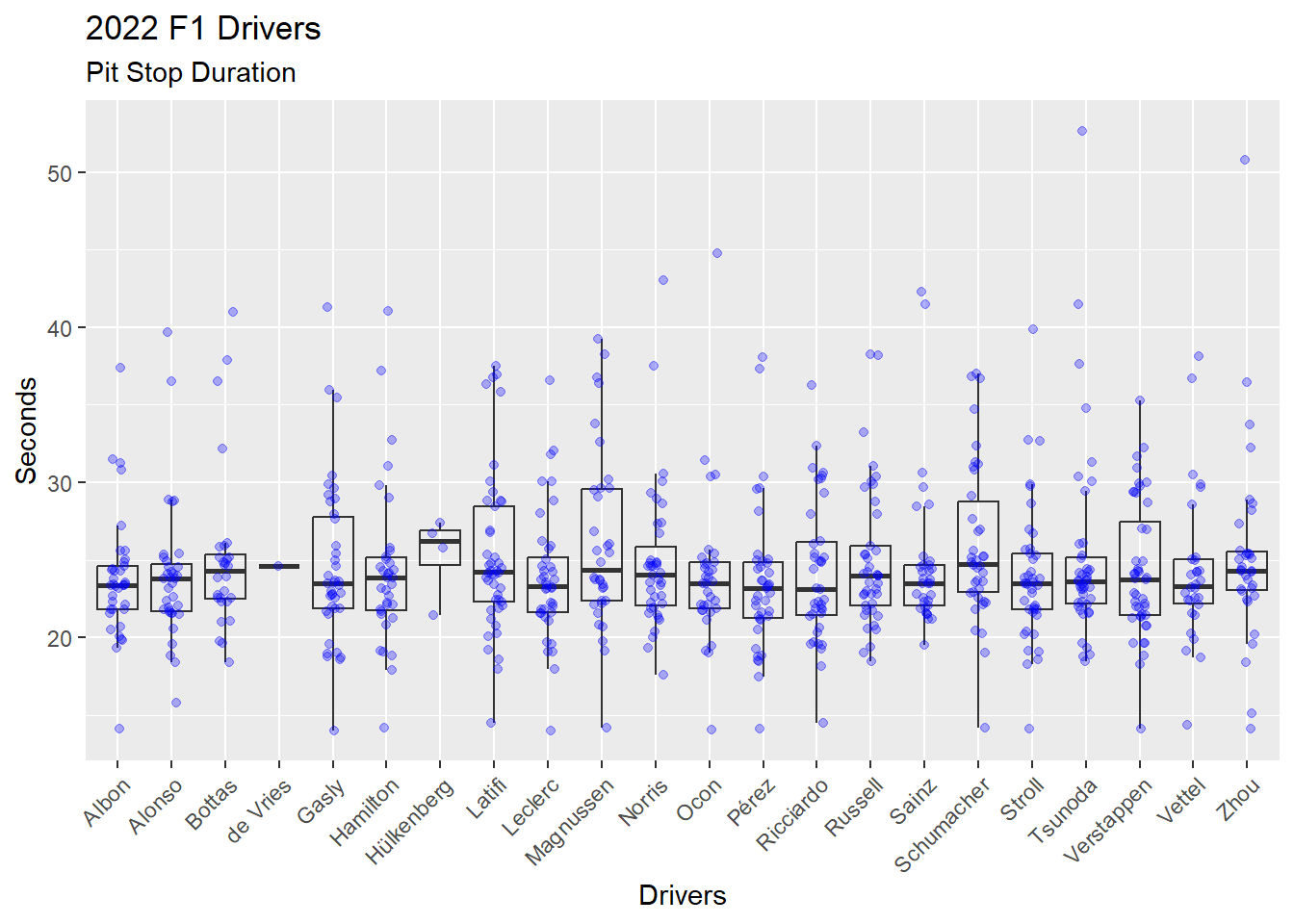
We can explore the distribution of pit stop durations for each driver by adding another layer to the visualization. Recall that ggplot2 provides a layered approach to building visualizations. Each layer requires: (1) Data; (2) Aesthetic; and (3) Geometric. We can add a new layer by providing these items for the new layer. In Figure 4.16 a layer has been added with geom_jitter(), which plots dots and allows those dots to be moved off the center line. The (1) Data and (2) Aesthetic are not provided in the geom_jitter() call and, thus, rely on the previous layers (1) Data and (2) Aesthetic. Three arguments are provided in the geom_jitter() call.
Alpha, which is opacity in the range of 0 (not visible) to 1 (solid). The
alpha = 0.3is 30% opacity. Thegeom_boxplot()is set to analpha = 0to prevent that layers dots from printing.Color of each dot.
Width of the jitter (i.e. the movement off the center line) as a percent. The
width = 0.15indicates the dots will spread up to 15% on both sides of the center line.
While Figure 4.16 is quite busy, the overlaying of boxplot and dots gives a sense of the distribution of the data that cannot be seen in either a boxplot alone or a scatter plot alone.
ps_full |>
  filter(ps.seconds < 130 & year == 2022) |>
  ggplot(aes(x = surname, y = ps.seconds)) +
  geom_boxplot(alpha = 0) +
  geom_jitter(alpha = 0.3, color = "blue", width = 0.15) +
  theme(axis.text.x = element_text(angle = 45, vjust = 1, hjust = 1)) +
  labs(
    title = "2022 F1 Drivers",
    subtitle = "Pit Stop Duration",
    x = "Drivers",
    y = "Seconds"
  )
We can specify different (1) Data and (2) Aesthetics when adding a new layer (Figure 4.17). This time we add the mean of the distribution for each driver as a red dot on top of each boxplot. Viewing the mean with a boxplot gives a sense of the skew of the data.
First, we calculate the mean of pit stop duration for each driver in 2022, and store these values in a data frame. This will be the data source for the new layer we will add to the visualization.
Note
There is a better way to add the mean to a visualization. See the code for Figure 4.18 with the stat_summary() function. The method used in the following code demonstrates the use of a separate data frame in a ggplot2 layer.
Second, we return to our Figure 4.15 boxplot code and then add a new layer with geom_point(). We add the (1) Data with an explicit data =, which is required, and we add the (2) Aesthetic.
# Calculate the means for each driver in 2022
# Store these values in a data frame
ps_mean_22 <- ps_full |>
  filter(ps.seconds < 130 & year == 2022) |>
  group_by(surname) |>
  summarise(ps.mean = mean(ps.seconds))

ps_full |>
  filter(ps.seconds < 130 & year == 2022) |>
  ggplot(aes(x = surname, y = ps.seconds)) +
  geom_boxplot() +
  geom_point(data = ps_mean_22, aes(x = surname, y = ps.mean), color = "red") +
  theme(axis.text.x = element_text(angle = 45, vjust = 1, hjust = 1)) +
  labs(
    title = "2022 F1 Drivers",
    subtitle = "Pit Stop Duration",
    x = "Drivers",
    y = "Seconds"
  )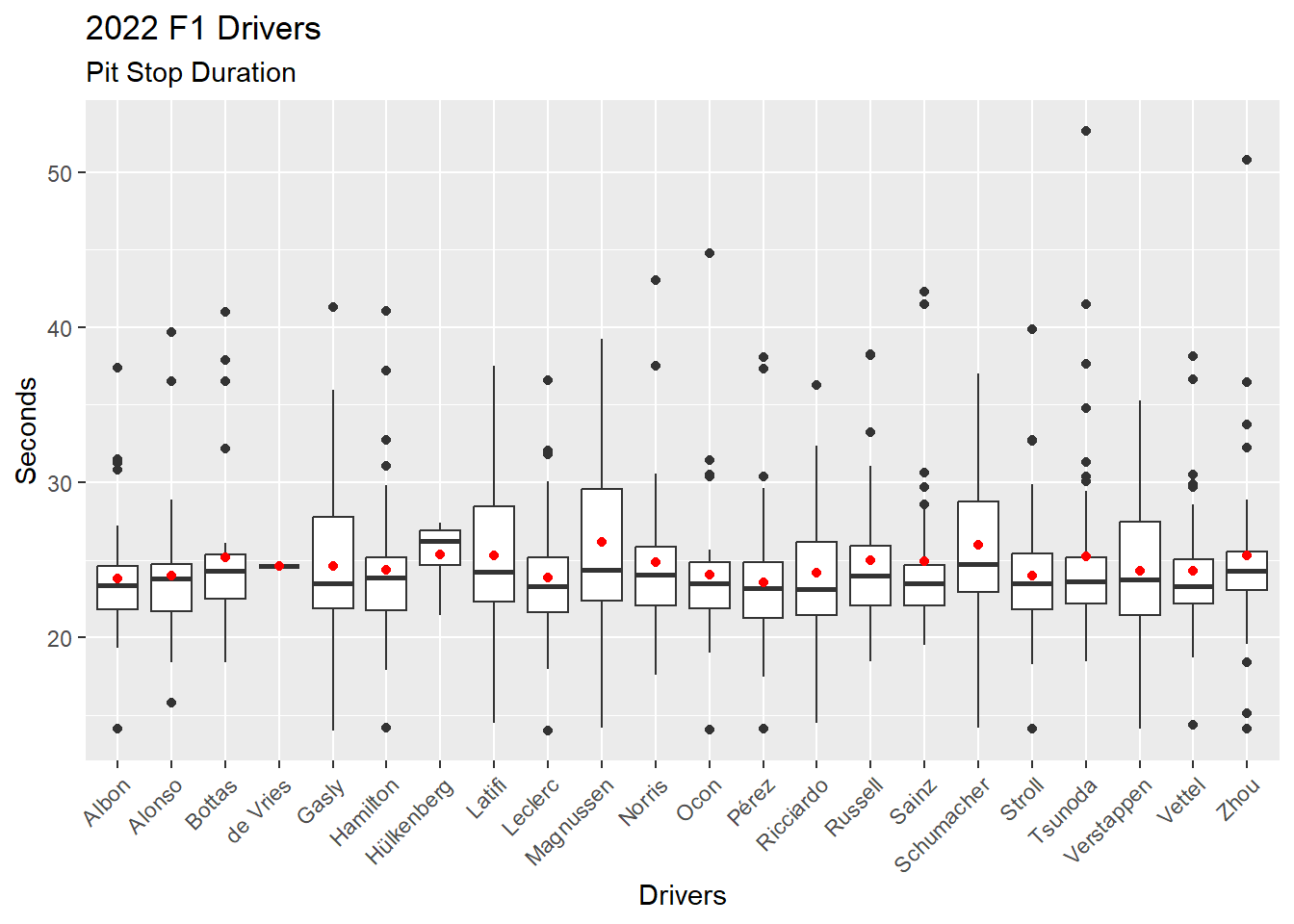
Figure 4.18 shows the better way of adding mean to the visualization by using the stat_summary() function.
ps_full |>
  filter(ps.seconds < 130 & year == 2022) |>
  ggplot(aes(x = surname, y = ps.seconds)) +
  geom_boxplot() +
  stat_summary(fun = mean, geom="point", color = "red") +
  theme(axis.text.x = element_text(angle = 45, vjust = 1, hjust = 1)) +
  labs(
    title = "2022 F1 Drivers",
    subtitle = "Pit Stop Duration",
    x = "Drivers",
    y = "Seconds"
  )
——————– Three Other Visualizations ——————–
ggplot2 has 50 geometrics and a seemingly endless supply of ways to customize visualizations. Learning to create visualizations with ggplot2 means learning to dig into the resources and figure out the details. The ggplot2 documentation is the best place to start. And, there are many, many online examples that can be found.
The R Graph Gallery provides hundreds of visualization examples.
Nicola Rennie has a great blog post, Another Year of #TidyTuesday (2017, Dec 27) describing her participation in the #TidyTuesday data science challenge, which includes visualizations.
Here are three more visualizations that provide meaningful information from our data.
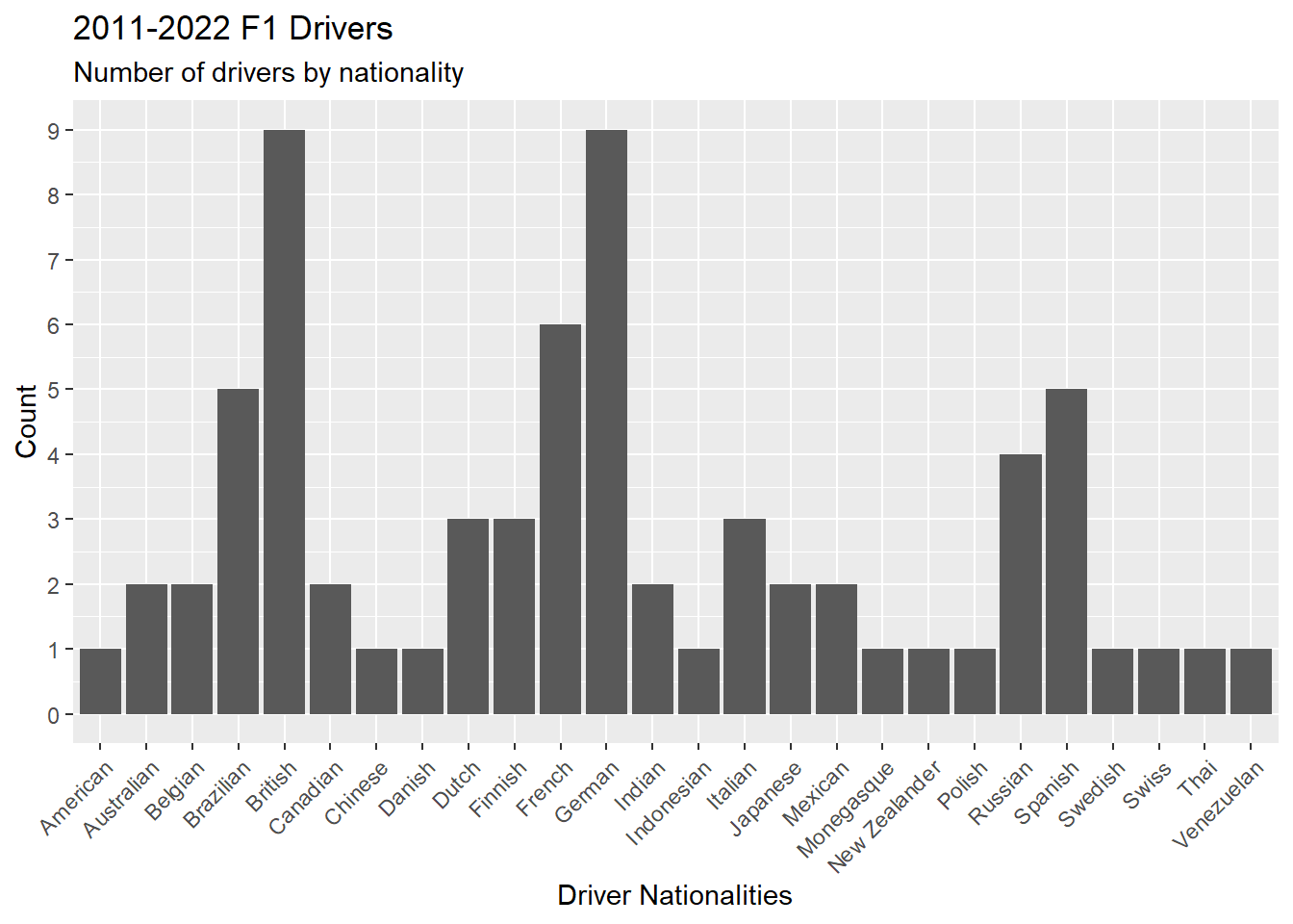
Figure 4.19 is a bar graph showing the number of drivers by nationality using the geometric geom_bar(). The scale_y_continuos() forces the y-axis to display eight numbers, which makes the chart more readable.
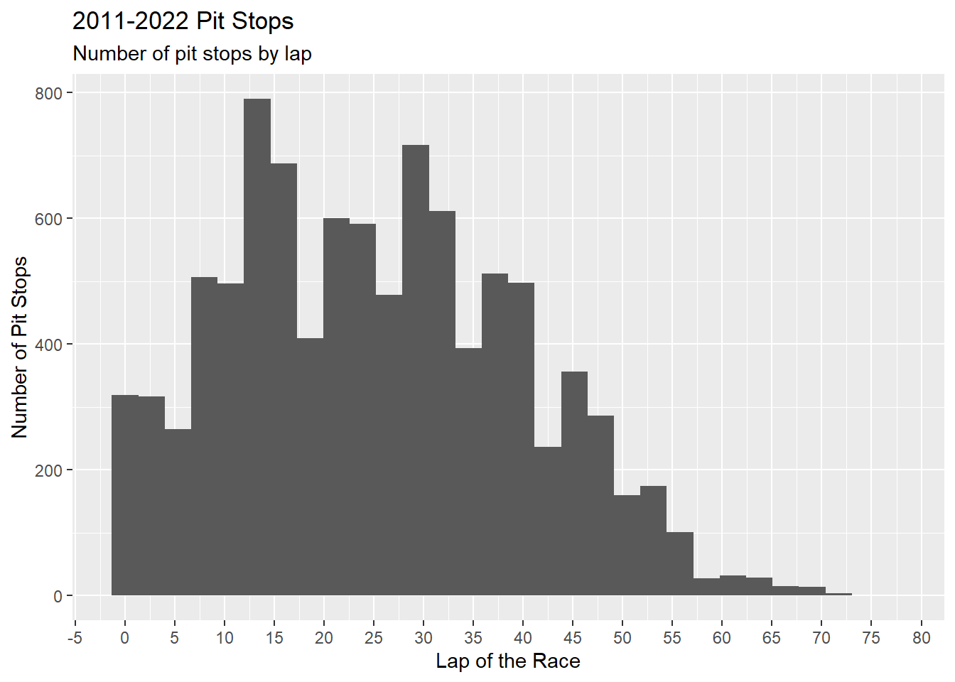
Figure 4.20 is a histogram showing the number of pit stops per lap using the geometric geom_histogram(). The scale_x_continuos() forces the x-axis to display 20 numbers, which makes the chart more readable.
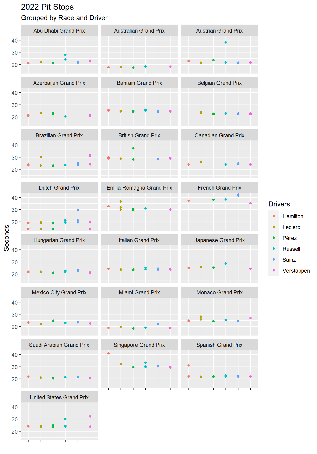
Figure 4.21 is a set of scatter plots using facet_wrap(), which divides a single chart into multiple charts based on one or more facets. In this case, the only facet is race.name. Notice that the color of the surname is set in geom_point(). Figure 4.21 would be too cluttered with all drivers. Thus, a vector of the top tier drivers is first created and then used to filter the visualization. The %in% is an operator the means: Is a value found in a vector or list?
ps_full |>
  distinct(driverId, .keep_all = TRUE) |>
  ggplot(aes(x = driver.nationality)) +
  geom_bar() +
  theme(axis.text.x = element_text(angle = 45, vjust = 1, hjust = 1)) +
  scale_y_continuous(n.breaks = 8) +
  labs(
    title = "2011-2022 F1 Drivers",
    subtitle = "Number of drivers by nationality",
    x = "Driver Nationalities",
    y = "Count"
  )
ps_full |>
  ggplot(aes(x = ps.lap)) +
  geom_histogram() +
  scale_x_continuous(n.breaks = 20) +
  labs(
    title = "2011-2022 Pit Stops",
    subtitle = "Number of pit stops by lap",
    x = "Lap of the Race",
    y = "Number of Pit Stops"
  )
# A vector of Red Bull, Ferrari, and Mercedes drivers
top_tier <- c("Verstappen", "Pérez", "Leclerc", "Sainz", "Hamilton", "Russell" )

ps_full |>
  filter(ps.seconds < 130 & year == 2022 & surname %in% top_tier) |>
  ggplot(aes(x = surname, y = ps.seconds)) +
  geom_point(aes(color = surname)) +
  theme(axis.text.x = element_blank()) +
  facet_wrap(~race.name, ncol = 3) +
  labs(
    title = "2022 Pit Stops",
    subtitle = "Grouped by Race and Driver",
    x = "",
    y = "Seconds",
    color = "Drivers"
  )
4.5 Explore Data
Resource: Wickham & Grolemund (2nd. ed.) chapter 12
Data set: ps_full from Section 4.2.0.1.
The goal of data exploration is to become familiar with the data. Recall from Section 4.2 that we identified a possible anomaly in the pit stop data (which was not an anomaly, just a very long pit stop), and in Section 4.3 we selected a cutoff (130 seconds) to exclude extremely long pit stops caused by race conditions. The cutoff is an example of satisficing. We cannot guarantee that all pit stops longer than 130 seconds were caused by race conditions, nor can we guarantee that pit stops shorter than 130 seconds were not caused by race conditions. But 130 seconds is a workable solution. It is an assumption that influenced all of the rest of our analysis. Data analysis requires being satisfied with workable solutions, with making intelligent assumptions that impact data analysis. Because of this, all analysis is subjective in some sense.
Another example of an intelligent assumption is the lower threshold for pit stops. We did not have one. Yet, the 2022 Dutch Grand Prix includes over a dozen pit stops in the low 14 second range. Is having no lower threshold an intelligent assumption or not?
ps_full |>
  filter(year == 2022 & race.name == "Dutch Grand Prix") |>
  select(ps.lap, ps.time, ps.seconds, surname) |>
  arrange(ps.seconds) |>
  print(n = 100)
# A tibble: 72 × 4
ps.lap ps.time ps.seconds surname
<dbl> <time> <dbl> <chr>
1 57 16:19:20 14.0 Gasly
2 57 16:18:32 14.0 Leclerc
3 57 16:19:10 14.0 Ocon
4 57 16:18:22 14.1 Verstappen
5 57 16:18:36 14.1 Pérez
6 56 16:18:24 14.1 Albon
7 57 16:19:11 14.1 Stroll
8 56 16:18:40 14.1 Zhou
9 56 16:18:26 14.1 Schumacher
10 57 16:18:18 14.2 Hamilton
11 56 16:18:34 14.2 Magnussen
12 56 16:18:30 14.3 Vettel
13 55 16:18:20 14.5 Latifi
14 56 16:19:00 14.5 Ricciardo
15 57 16:18:53 15.8 Alonso
16 56 16:17:37 18.6 Gasly
17 32 15:45:03 18.7 Gasly
18 48 16:07:10 18.7 Vettel
19 40 15:54:40 18.7 Pérez
20 13 15:20:05 18.8 Tsunoda
21 11 15:17:31 18.8 Gasly
22 14 15:21:05 18.8 Pérez
23 29 15:40:15 19.0 Hamilton
24 17 15:24:47 19.1 Leclerc
25 45 16:00:48 19.1 Leclerc
26 56 16:17:12 19.1 Stroll
27 35 15:49:07 19.2 Vettel
28 48 16:05:02 19.2 Hamilton
29 56 16:16:29 19.2 Pérez
30 42 15:57:54 19.3 Tsunoda
31 17 15:25:04 19.3 Norris
32 21 15:30:35 19.3 Albon
33 31 15:42:53 19.4 Russell
34 18 15:26:30 19.5 Ocon
35 43 15:58:43 19.5 Sainz
36 11 15:17:33 19.5 Ricciardo
37 12 15:18:49 19.5 Zhou
38 27 15:38:47 19.6 Ricciardo
39 56 16:16:24 19.6 Leclerc
40 12 15:18:45 19.6 Alonso
41 48 16:04:44 19.6 Verstappen
42 18 15:25:58 19.6 Verstappen
43 56 16:15:47 19.7 Verstappen
44 47 16:05:38 19.7 Ricciardo
45 16 15:24:05 19.7 Bottas
46 42 15:58:02 19.9 Albon
47 54 16:15:44 20.1 Latifi
48 55 16:16:34 20.2 Zhou
49 16 15:23:49 20.2 Stroll
50 38 15:52:27 20.2 Stroll
51 47 16:05:28 20.3 Schumacher
52 13 15:20:19 20.3 Latifi
53 55 16:16:52 20.3 Ricciardo
54 55 16:16:14 20.5 Albon
55 26 15:37:39 20.7 Latifi
56 48 16:05:08 20.7 Russell
57 14 15:21:35 20.8 Magnussen
58 34 15:47:42 21.0 Bottas
59 47 16:04:07 21.1 Norris
60 57 16:18:46 21.2 Sainz
61 57 16:18:50 21.3 Norris
62 57 16:18:21 21.4 Russell
63 47 16:04:12 21.5 Alonso
64 56 16:17:06 21.6 Ocon
65 33 15:46:28 21.8 Schumacher
66 9 15:14:56 22.4 Vettel
67 47 16:05:32 23.7 Magnussen
68 34 15:47:53 23.7 Magnussen
69 37 15:51:33 25.4 Zhou
70 13 15:20:02 26.8 Schumacher
71 14 15:21:02 29.7 Sainz
72 43 16:01:22 52.7 Tsunoda Comparing the summary statistics for normal pit stops (defined here as over 16 seconds and under 50 seconds – another intelligent assumption) with the summary statistics for very fast pit stops (under 16 seconds) raises a question: How could teams knock off more than 5 seconds on average on the hand-full of pit stops in laps 55-57? A little online investigation revealed that all of these pit stops occurred in laps when there was a safety car. However, the safety car does not explain this anomaly as the safety car only impacts on-track speed of the race cars.
# Normal pit stops
ps_full |>
  filter((ps.seconds > 16 & ps.seconds < 50) & year == 2022 & race.name == "Dutch Grand Prix") |>
  summarise (
    min = min(ps.seconds),
    quant_1 = quantile(ps.seconds, 0.25),
    median = median(ps.seconds),
    mean = mean(ps.seconds),
    quant_2 = quantile(ps.seconds, 0.75),
    max = max(ps.seconds)
  )
# A tibble: 1 × 6
min quant_1 median mean quant_2 max
<dbl> <dbl> <dbl> <dbl> <dbl> <dbl>
1 18.6 19.3 19.7 20.4 20.9 29.7# Very fast pit stops
ps_full |>
filter(ps.seconds < 16 & year == 2022 & race.name == "Dutch Grand Prix") |>
summarise (
min = min(ps.seconds),
quant_1 = quantile(ps.seconds, 0.25),
median = median(ps.seconds),
mean = mean(ps.seconds),
quant_2 = quantile(ps.seconds, 0.75),
max = max(ps.seconds)
)# A tibble: 1 × 6
min quant_1 median mean quant_2 max
<dbl> <dbl> <dbl> <dbl> <dbl> <dbl>
1 14.0 14.1 14.1 14.3 14.3 15.8——————– Outliers ——————–
Exploring outliers is an important part of data exploration. There are several ways to explore outliers.
Boxplots
Outliers are mathematically defined as any value above the upper fence (three dots in Figure 4.22) and any value below the lower fence (one dot in Figure 4.22). The formulas for the upper fence and lower fence are fixed.
\[IRQ = Q3 - Q1\] \[Upper Fence = Q3 + (1.5 * IRQ)\] \[Lower Fence = Q1 - (1.5 * IRQ)\]
Figure 4.22 displays pit stops for Pérez in two layers: (1) Boxplot; (2) Red dot showing Pérez’s mean. The scale_y_continuos() forces the y-axis to display 16 numbers, which makes the chart more readable.
Figure 4.22 identifies three possible long outlier pit stops and one possible short outlier pit stop. Keep in mind that a boxplot does not tell you that certain data points are outliers. Instead, a boxplot tells you that certain data points are mathematically identified as outliers given the formulas above.
ps_full |>
  filter(ps.seconds < 130 & year == 2022 & surname == "Pérez") |>
  ggplot(aes(x = surname, y = ps.seconds)) +
  geom_boxplot() +
  stat_summary(fun = mean, geom="point", color = "red", size = 3) +
  theme(axis.title.x = element_blank(), axis.title.y = element_blank()) +
  scale_y_continuous(n.breaks = 16)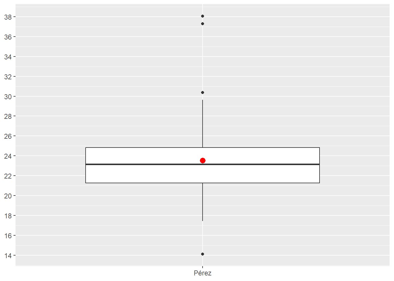
Histogram
Figure 4.23 displays pit stops for Pérez in one layer as a histogram. The scale_y_continuos() forces the y-axis to display 10 numbers, which makes the chart more readable. The scale_x_continuos() forces the x-axis to display 14 numbers, which makes the chart more readable. These numbers are found through experimentation.
Figure 4.23 reveals a bit more detail about the distribution of Pérez’s pit stops. Most interesting is a comparison of first long outlier in Figure 4.22 (just over 30 seconds long) and the group of three pit stops around 30 seconds in Figure 4.23.
ps_full |>
  filter(ps.seconds < 130 & year == 2022 & surname == "Pérez") |>
  ggplot(aes(x = ps.seconds)) +
  geom_histogram() +
  theme(axis.title.x = element_blank(), axis.title.y = element_blank()) +
  scale_y_continuous(n.breaks = 10) +
  scale_x_continuous(n.breaks = 14)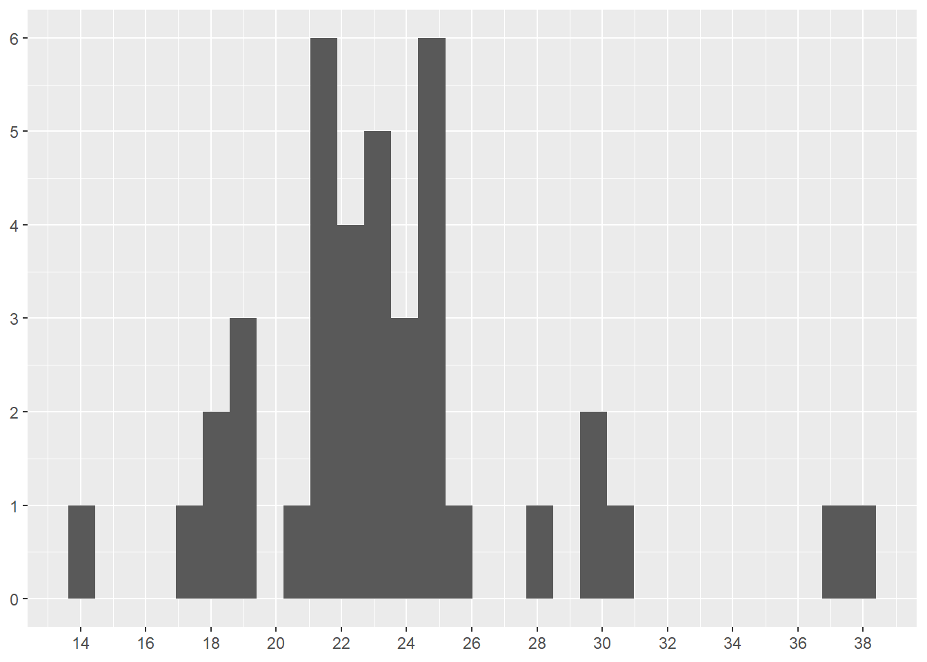
Z-score
The z-score is a measure of standard deviation calculated for each value of the observation (X in the equation).μ is the population mean and σ is the standard deviation. Outliers are mathematically defined as any value below -3 and any value above 3.
\[z = (X – μ) / σ \]
We can calculate z-scores for Pérez’s pit stops by first separating Pérez’s data and then applying the formula. The result is a vector of z-scores with no values below -3 and only one value above 3. As with the boxplot, z-scores do not tell you that certain data points are outliers. Instead, z-scores tell you that certain data points are mathematically identified as outliers given the formulas above.
# Separate Pérez's data
perez_ps <- ps_full |>
  filter(ps.seconds < 130 & year == 2022 & surname == "Pérez")

# Apply the z-score formula and save the results
perez_z_score <- (perez_ps$ps.seconds - mean(perez_ps$ps.seconds)) / sd(perez_ps$ps.seconds)

# Display the results
sort(perez_z_score)
[1] -2.00636880 -1.29977613 -1.08722386 -1.06892607 -1.02233052 -1.00169232
[7] -0.91339483 -0.65148107 -0.51594975 -0.50552426 -0.46446061 -0.46297125
[13] -0.40935447 -0.39339709 -0.32148251 -0.25403599 -0.25403599 -0.18999372
[19] -0.14339818 -0.08318567 -0.05190921 -0.03488801 -0.02978165 0.02936703
[25] 0.03298404 0.13404743 0.18425997 0.21128113 0.26766387 0.28702548
[31] 0.29872756 0.31979130 0.37851445 0.98127778 1.27808500 1.29446791
[37] 1.45170127 2.92743953 3.08892819Viewing a histogram of the z-scores is informative. Notice the two pit stops near 3.0 (2.927 and 3.088 in the table above). These are the two highest values in the boxplot (Figure 4.22). Also notice the grouping around 1.0-1.5. The z-score at 1.5 is the first long outlier (just over 30 seconds long) identified in Figure 4.22.
As you can see, the mathematical formula for z-score and boxplot result in different data points being identified as outliers. Neither z-scores nor boxplots tell you that certain data points are outliers. Instead, z-scores and boxplots tell you that certain data points are mathematically identified as outliers given the formulas each method uses.
ggplot() +
  geom_histogram(aes(perez_z_score)) +
  theme(axis.title.x = element_blank(), axis.title.y = element_blank()) +
  scale_y_continuous(n.breaks = 10) +
  scale_x_continuous(n.breaks = 10)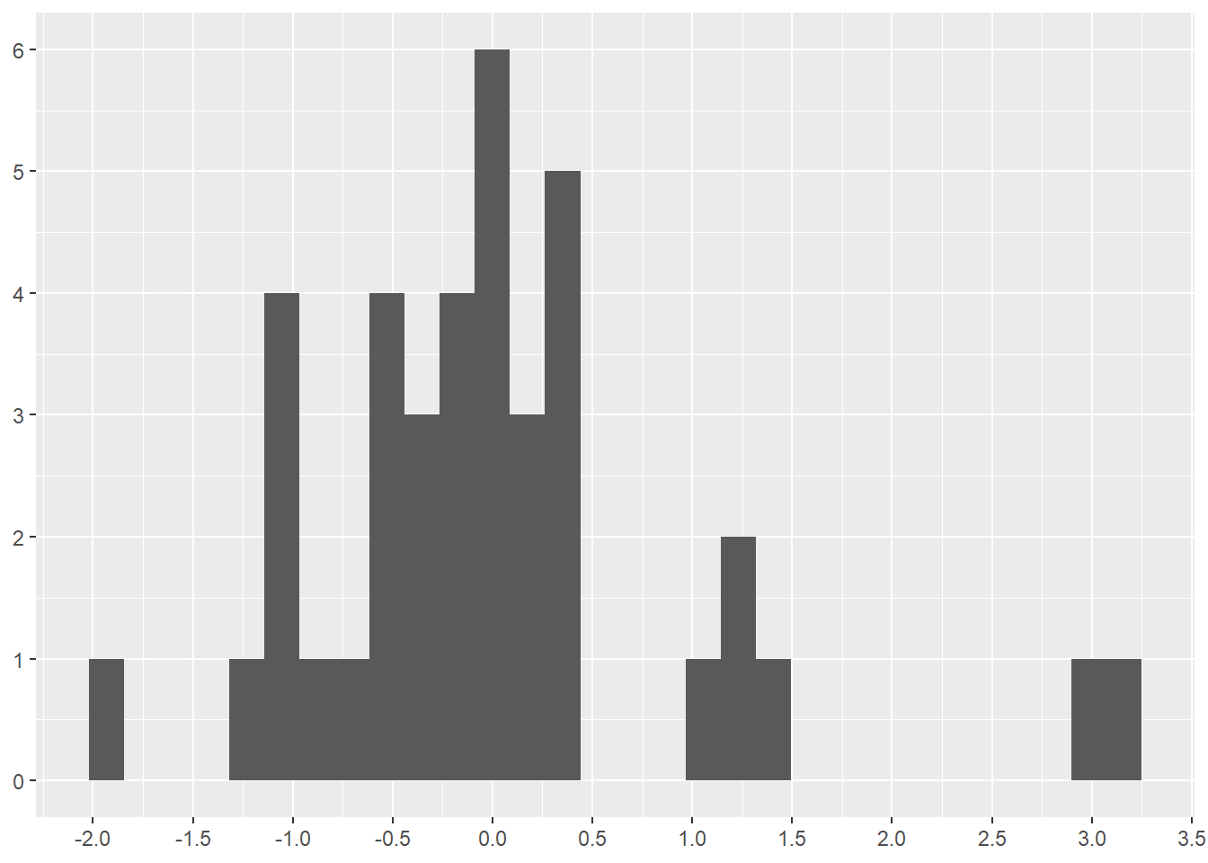
————————————————–
I decided to further investigate the short pit stops at the 2022 Dutch Grand Prix. The boxplot (Figure 4.22) mathematically identified Pérez’s short pit stop as an outlier. The z-scores did not.
I rewatched portions of the 2022 Dutch Grand Prix via F1 TV (subscription required) and found the answer to this anomaly at time 01:23:22 of the broadcast. The safety car lead all the race cars through the pit lane while the stewards removed the stalled car of Bottas from the track. Bottas’ car had stalled in the section of the track that parallels the pit lane. Thus, none of these times are pit stop times. Rather, these times represent how long it took the cars to travel through the pit lane without stopping. The speed limit in the pit lane of the Dutch Grand Prix is 60 km/h (37.3 mph) for safety reasons.
Hamilton was directly behind the safety car and entered the pit lane at 16:18:18 (4:18 PM local time) (see the output below the code). The other cars followed, with Gasly being the last car at 16:19:20. This output shows that three drivers (Ocon, Stroll, and Gasly) made normal pit stops on the lap before they each went through the pit lane behind the safety car.
Thus, all of the pit stop times beginning with Hamilton’s 16:18:18 run through the pit lane should be removed from the 2022 pit stop data before drawing conclusions about pit stop times. Was having no lower threshold for pit stops an intelligent assumption?
What other 2022 races have similar or different anomalies that should be investigated?
library(lubridate)     # Create a time to use in filter()

ps_full |>
  filter(year == 2022 & race.name == "Dutch Grand Prix" & ps.time > make_datetime(hour = 16, min = 17)) |>
  select(ps.lap, ps.time, ps.seconds, surname) |>
  arrange(ps.time) |>
  print(n = 25)
# A tibble: 21 × 4
ps.lap ps.time ps.seconds surname
<dbl> <time> <dbl> <chr>
1 56 16:17:06 21.6 Ocon
2 56 16:17:12 19.1 Stroll
3 56 16:17:37 18.6 Gasly
4 57 16:18:18 14.2 Hamilton
5 55 16:18:20 14.5 Latifi
6 57 16:18:21 21.4 Russell
7 57 16:18:22 14.1 Verstappen
8 56 16:18:24 14.1 Albon
9 56 16:18:26 14.1 Schumacher
10 56 16:18:30 14.3 Vettel
11 57 16:18:32 14.0 Leclerc
12 56 16:18:34 14.2 Magnussen
13 57 16:18:36 14.1 Pérez
14 56 16:18:40 14.1 Zhou
15 57 16:18:46 21.2 Sainz
16 57 16:18:50 21.3 Norris
17 57 16:18:53 15.8 Alonso
18 56 16:19:00 14.5 Ricciardo
19 57 16:19:10 14.0 Ocon
20 57 16:19:11 14.1 Stroll
21 57 16:19:20 14.0 Gasly If all of this detail seems a bit complicated and time consuming, it is. Exploring data requires time, commitment, and determination. Data analysis supports decision making (in business, in politics, in healthcare, in … etc.) Sloppy data analysis provides fragile support.
4.5.1 Looking for other common anomalies
——————– Missing values ——————–
Resource: Wickham & Grolemund (2nd. ed.) chapter 20
Here is a loop to search all the columns in the data set for NA or NaN values. The loop discovered 1177 missing values in the driver.number attribute and no missing values in the other attributes.
num_na <- 0
for(i in 1:ncol(ps_full)){
  num_na <- ps_full[,i] |>
    is.na() |>
    sum()
  cat(colnames(ps_full[,i]), " = ", num_na, "\n")
  num_na <- 0
}
raceId = 0
driverId = 0
ps.number = 0
ps.lap = 0
ps.time = 0
ps.seconds = 0
year = 0
race.number = 0
circuitId = 0
race.name = 0
race.date = 0
driver.number = 1177
driver.code = 0
forename = 0
surname = 0
dob = 0
driver.nationality = 0 The row and column reference inside [] after the data frame name indicate the desired rows and/or columns. The format is: data_frame[row_numbers, column_numbers]. Quoted column names inside the combine function, c(), can be used as substitutes for the column numbers.
Imputation is a common method for dealing with missing values. Imputation creates guessed values for the missing values based on calculations from existing values. Two common imputation methods include the following:
Calculation based on mean or mode or other advanced calculation methods. The
tidyrpackage has the replace_na() function to accomplish this imputation method.Copy based on copying nearby values to the missing values. The
tidyrpackage has the fill() function to accomplish this imputation method.
Alternatively, we can drop observations with missing values. The tidyr package has the drop_na() function to accomplish this method.
All imputations are guesses. In a perfect data analysis world we would not make guesses. But guesses are often required.
Our specific missing data is in the driver.number attribute, which cannot be calculated. R has this attributed saved as a double type, but it is not. This attribute is a label, like a jersey number on an athlete. The only way to replace these missing values is to do the hard work of finding out the actual numbers for each driver. Alternatively, we can choose to live with the missing values, which is what we will do until the driver.number becomes important to our analysis.
——————– Duplicate Rows (a.k.a observations) ——————–
We can search for duplicate rows with the following code, which shows that there are no duplicates in our data set.
ps_full |>
  group_by_all() |>
  filter(n() > 1) |>
  ungroup()
The following code illustrates finding and removing duplicate rows by: (1) Creating a test data frame with duplicates; (2) Looking for duplicates; (3) Removing duplicates with the dplyr package distinct() function
# Step 1: Create a test data frame with duplicates
dup_rows_df <- ps_full |>
  slice(rep(59,3))     # Duplicate row 59 three times

# Add 7 other rows that are not duplicated
for(i in 1:7){
  new_row <- nrow(dup_rows_df)+1
  dup_rows_df[new_row,] <- ps_full[i,]
}
# Step 2: Look for duplicates
dup_rows_df |>
group_by_all() |>
filter(n() > 1) |>
ungroup()# A tibble: 3 × 17
raceId driverId ps.num…¹ ps.lap ps.time ps.se…² year race.…³ circu…⁴ race.…⁵
<dbl> <dbl> <dbl> <dbl> <time> <dbl> <dbl> <dbl> <dbl> <chr>
1 842 67 1 15 16:30:23 23.3 2011 2 2 Malays…
2 842 67 1 15 16:30:23 23.3 2011 2 2 Malays…
3 842 67 1 15 16:30:23 23.3 2011 2 2 Malays…
# … with 7 more variables: race.date <date>, driver.number <dbl>,
# driver.code <chr>, forename <chr>, surname <chr>, dob <date>,
# driver.nationality <chr>, and abbreviated variable names ¹ps.number,
# ²ps.seconds, ³race.number, ⁴circuitId, ⁵race.name# Step 3: Remove duplicates and display the data frame
dup_rows_df <- dup_rows_df |>
distinct()
dup_rows_df# A tibble: 8 × 17
raceId driverId ps.num…¹ ps.lap ps.time ps.se…² year race.…³ circu…⁴ race.…⁵
<dbl> <dbl> <dbl> <dbl> <time> <dbl> <dbl> <dbl> <dbl> <chr>
1 842 67 1 15 16:30:23 23.3 2011 2 2 Malays…
2 841 153 1 1 17:05:23 26.9 2011 1 1 Austra…
3 841 30 1 1 17:05:52 25.0 2011 1 1 Austra…
4 841 17 1 11 17:20:48 23.4 2011 1 1 Austra…
5 841 4 1 12 17:22:34 23.3 2011 1 1 Austra…
6 841 13 1 13 17:24:10 23.8 2011 1 1 Austra…
7 841 22 1 13 17:24:29 23.6 2011 1 1 Austra…
8 841 20 1 14 17:25:17 22.6 2011 1 1 Austra…
# … with 7 more variables: race.date <date>, driver.number <dbl>,
# driver.code <chr>, forename <chr>, surname <chr>, dob <date>,
# driver.nationality <chr>, and abbreviated variable names ¹ps.number,
# ²ps.seconds, ³race.number, ⁴circuitId, ⁵race.name——————– Duplicate Columns (a.k.a variables or attributes) ——————–
We need to create a data frame with a duplicate column to demonstrate how to remove duplicate columns.
dup_col_df <- ps_full |>
  mutate(ps.sec.2 = ps.seconds)    # Duplicate the `ps.seconds` column

dup_col_df[ , c("ps.seconds", "ps.sec.2")]   # View both attributes
# A tibble: 9,634 × 2
ps.seconds ps.sec.2
<dbl> <dbl>
1 26.9 26.9
2 25.0 25.0
3 23.4 23.4
4 23.3 23.3
5 23.8 23.8
6 23.6 23.6
7 22.6 22.6
8 24.9 24.9
9 25.3 25.3
10 25.3 25.3
# … with 9,624 more rowsThe process of identifying duplicate columns begins with converting the data frame to a list. The biggest difference between a vector and a list is that the list can contain multiple types objects at the same time where a vector can contain only one type of object at a time.
We use the duplicated() function to identify duplicate columns. This function returns a vector of logical values (TRUE or FALSE values) where TRUE means the column is a duplicate.
duplicate_result <- dup_col_df |>
  as.list() |>                            # Convert data frame to a list
  duplicated()

# Output results showing the last column in the data frame is a duplicate
duplicate_result
[1] FALSE FALSE FALSE FALSE FALSE FALSE FALSE FALSE FALSE FALSE FALSE FALSE
[13] FALSE FALSE FALSE FALSE FALSE TRUE# Display the name of the duplicate column
colnames(dup_col_df[duplicate_result])[1] "ps.sec.2"Finally, we remove the duplicate columns by saving all the non-duplicate columns. We must use the ! (not operator) to invert the vector of logical values created with duplicated(). The ! turns a TRUE into a FALSE and a FALSE into a TRUE. By doing this we keep the non-duplicate columns (because they are now represented with TRUE) and drop the duplicate columns (because they are now represented with FALSE)
# Save all non-duplicate columns
dup_col_df <- dup_col_df[!duplicate_result]

# Print columns names to demonstrate `ps.sec.2` has been removed
colnames(dup_col_df)
[1] "raceId" "driverId" "ps.number"
[4] "ps.lap" "ps.time" "ps.seconds"
[7] "year" "race.number" "circuitId"
[10] "race.name" "race.date" "driver.number"
[13] "driver.code" "forename" "surname"
[16] "dob" "driver.nationality"We can combine all of the above steps into one step with embedded functions (shown below). Unfortunately, we cannot create a piped version of these embedded functions because pipes does not work with !.
dup_col_df <- dup_col_df[!duplicated(as.list(dup_col_df))]4.6 Add and Delete Data
——————– Rows (a.k.a observations) ——————–
The dplyr package has several experimental row functions that can be used. Being experimental, these functions may or may not be available in the future. Thus, we will focus on other methods.
We used the rep() function inside the slice() function to duplicate a row in Step 1 in the working with duplicate rows section.
rep() is the base R replicate function. It takes a value and repeats it a specific number of times. rep() alone produces a list rather than a data frame.
slice() is a tidyverse function. It uses the index number (i.e. row number) to reference a row. slice() alone can be used to view specific rows using positive numbers ore delete specific rows using negative numbers.
# Step 1 of working with duplicate rows
# Creates a new data frame
dup_rows_df <- ps_full |>
  slice(rep(4,2))     # Duplicate row 4 twice

# Create a new list
dup_list <- ps_full |>
  rep(4,2)            # Duplicate row 4 twice

slice(ps_full, 4)     # Display row 4
# A tibble: 1 × 17
raceId driverId ps.num…¹ ps.lap ps.time ps.se…² year race.…³ circu…⁴ race.…⁵
<dbl> <dbl> <dbl> <dbl> <time> <dbl> <dbl> <dbl> <dbl> <chr>
1 841 4 1 12 17:22:34 23.3 2011 1 1 Austra…
# … with 7 more variables: race.date <date>, driver.number <dbl>,
# driver.code <chr>, forename <chr>, surname <chr>, dob <date>,
# driver.nationality <chr>, and abbreviated variable names ¹ps.number,
# ²ps.seconds, ³race.number, ⁴circuitId, ⁵race.name# The function `n()` returns the count of rows in a data frame
slice(ps_full, n()-10:n()) # Display the last 10 rows# A tibble: 9,624 × 17
raceId driverId ps.nu…¹ ps.lap ps.time ps.se…² year race.…³ circu…⁴ race.…⁵
<dbl> <dbl> <dbl> <dbl> <time> <dbl> <dbl> <dbl> <dbl> <chr>
1 1096 815 2 33 17:53:33 21.4 2022 22 24 Abu Dh…
2 1096 822 1 30 17:49:54 22.6 2022 22 24 Abu Dh…
3 1096 825 1 28 17:46:53 22.4 2022 22 24 Abu Dh…
4 1096 20 1 25 17:41:51 23.2 2022 22 24 Abu Dh…
5 1096 844 1 21 17:35:10 22.2 2022 22 24 Abu Dh…
6 1096 830 1 20 17:33:31 22.7 2022 22 24 Abu Dh…
7 1096 817 1 19 17:32:38 21.9 2022 22 24 Abu Dh…
8 1096 4 1 19 17:32:33 21.7 2022 22 24 Abu Dh…
9 1096 1 1 18 17:30:48 21.3 2022 22 24 Abu Dh…
10 1096 832 1 17 17:29:08 21.9 2022 22 24 Abu Dh…
# … with 9,614 more rows, 7 more variables: race.date <date>,
# driver.number <dbl>, driver.code <chr>, forename <chr>, surname <chr>,
# dob <date>, driver.nationality <chr>, and abbreviated variable names
# ¹ps.number, ²ps.seconds, ³race.number, ⁴circuitId, ⁵race.name# Remove the second row
dup_rows_df<- dup_rows_df |>
slice(-2)We can add a row to an existing data frame using the nrow() function to find the last row number of the data frame. Then we assign whatever value we desire to the new row.
# Duplicate row 3 in the existing data frame
dup_rows_df[nrow(dup_rows_df)+1,] <- dup_rows_df[3,]

# Duplicate a row from another data frame
dup_rows_df[nrow(dup_rows_df)+1,] <- ps_full[60,]
The row and column reference inside [] after the data frame name indicate the desired rows and/or columns. The format is: data_frame[row_numbers, column_numbers]. Quoted column names inside the combine function, c(), can be used as substitutes for the column numbers.
We can also use the add_row() function from the dplyr package and insert values for each attribute. Missing values are assigned NA. As you can see, this would be quite tedious to add all the attributes. Sometimes tedious is necessary.
dup_rows_df <- dup_rows_df |>
  add_row(
  year = 2011,
  driver.code = "BAR",
  forename = "Rubens",
  surname = "Barrichello",
  driver.nationality = "Brazilian"
)
Delete rows containing NA values using the drop_na() function from the tidyr package.
library(tidyr)  # For `drop_na()`

dup_rows_df <- dup_rows_df |>
  drop_na()
——————– Columns (a.k.a variables or attributes) ——————–
We used the mutate() function from the dplyr package to duplicate a column in the working with duplicate columns section. mutate() can be used to add or remove values, including entire columns. In Section 4.2 we used mutate() to add a new column with a calculation based on another column.
We can remove specific columns by using the mutate() function and retain specific columns using the select() function.
# Create a new data set with 10 random rows from another data set
col_df <- ps_full |>
  slice_sample(n = 10)

# Remove the `ps.time` column, which is the fifth column
col_df <- col_df |>
  mutate(ps.time = NULL  )

# Retain only the listed columns
col_df <- col_df |>
  select(
    driverId,
    driver.number,
    driver.code,
    forename,
    surname,
    dob,
    driver.nationality
    )
We can also use the [] to accomplish the same thing as the mutate() and select() functions.
# Create a new data set with 10 random rows from another data set
col_df <- ps_full |>
  slice_sample(n = 10)

# Remove the fifth column, which is the `ps.time` column
col_df <- col_df[ ,-5]

# Retain only the specified numbered columns, which match the named list
# in the `select()` code above
col_df <- col_df[ , c(2,11:16)]

# We can also use the names of columns to retain them
col_df <- col_df[ , c(
    "driverId",
    "driver.number",
    "driver.code",
    "forename",
    "surname",
    "dob",
    "driver.nationality"
  )]